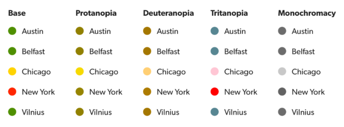
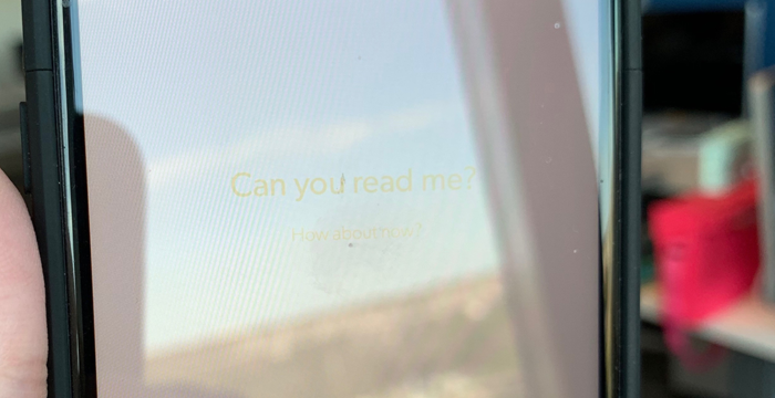
Creating accessible color contrast A while back, I wrote about how color blindness can affect the implied meaning in our usage of color. The use of stoplight colors for status is less meaningful if your eyes aren’t helping you distinguish between red and green. We got around this problem through the use of meaningful shapes…
Tag: accessibility
Color Vision Deficiency
When discussing design, color is often treated as a purely emotional or psychological aspect, and it can be hard to quantify. There are a few places where certain uses of color convey meaning in an easily understood way. A group of colors almost universally understood are Stoplight or Traffic Signal colors. My daughter would sing…
Lessons from the playground
(This article was written for the Bazaarvoice User Experience newsletter, b:focused. Cover Photo by Kelly Sikkema.) One of the biggest hurdles to overcome when beginning to design and develop inclusive products and services is the fear that including everyone is an impossible task. There are so many things people to consider that it can feel insurmountable. Changing…
Inclusive by design
The following is an article I wrote for my company’s R&D newsletter, and the perspective is angled to that reader. I was asked one day “is accessibility still a selling point?” I blinked. I’d never considered that ensuring our customers can use our product was a selling point; it’s just what they expect when they…